Friday 8 May 2009

Final edit of sting & a quick look back

Well here it is, in all of it's glory:


changing the video to stretch to 4:3 with a 4.22:1 pixel aspect ratio was the last touch up to do so it would still be 16:9 wide screen.

I think the overall outcome of the sting is acceptable and alright. The timing is a bit off and some colors don't seem to work well as others, however it was a bit of a bumpy ride working all together. I think if laurel was a bit more easy going and being less critical we probably wouldn't have the one sting to hand in on the deadline.

so thats it, it was fun to learn a bit about how you act in a team and I think i came out with a better understanding of my positives and negatives.

Tuesday 5 May 2009

silhouettes!

It's been a while since I've been on here so I'll explain:
What we, the first years, have been up to for the past few weeks have been working on is decorating our exhibition which will showcase not only some of our work from the past year but it will also showcase the 10 second stings we've created. The way we're going to design the exhibition we decided was going to create silhouettes of famous characters of animation and then with
separate layers and hang these up to give a 3D effect to the finished piece.
I was given the job of doing Wallace and Gromit, which I feel I've had a good
go at. hopefully get some photos of the whole process this week and I'll try to get
them up here asap.

Monday 30 March 2009

colouring! XD

animation finished AND coloured! 2-in-1!


All is needed is a little more clean up, the sound (obviously) and the blurred background which needs to be in the second shot:


Animation test 2!

Some more animation tests!


This one we used the finished background Becky had produced:
It was touched up when we placed it into the line test afterward.

Backgrounds/Layouts

I gave this to Becky as a really rough plan to follow. the basic layout and some little ideas such as the tree painted on the wall behind the bustop, which is our little homage to My Neighbour Totoro aswell as showing our inspiration from that film too.

Becky's first go was in the right direction:
I really liked this as a first design concept, however Becky felt it was to dark for our sting, and I can see what she was meaning. I felt that the brick wall and bench were also been hidden behind the darkness.

The next concept Becky shows me is alot more brighter and very stylish. I just love the way the trees are done over the brick wall. I decided that we should use the tree design for the final background.

Rough animation tests =D

Here are some rough plans for a few of the actions I animated:

Here's the rough line test:


Personally, I thought it worked well for what I wanted at the time, the student was offended that he wasn't allowed even a Peeking the paper, so he starts to look over more aggressively. It was when talking it over with paul, and later on with lez, that I realised he got angry to quickly and now that the business man was replaced with a monster the student's aims were no longer really showing through. I totally understood what was needed for it to work. subtlety.

I'd thought I would leave it for a little while and come back to it later.

Totoro-like creature

After a chat with both sean and lez, I've decided to scrap the business character and go for something a little more absurd.
taking what sean had given me, it should be a monster instead whose reading the newspaper then just suddenly pops out from the newspaper and eats up the student. Becky would than add something to the conversation that would be the main point for our influence:

We would use this screenshot from My Neighbour Totoro as it's pretty much the same camera shot, it's a bus stop and it also has a monster. It's quite surprising, now with the monster replacing the business man, how it really does have links to this shot. Could of been a sub-concious thought running though my head storyboarding at the time.

So with that image as a starting point I asked Becky if she could do a rough concept for me, nothing really specific but just to keep it in the same universe as our sting.

She cam back to me with this image and I have to say I'm very impressed. it's got this tazmanian-devil charm to it aswell as a touch of Totoro. The only fault i have with it is that it's not as edgy as a wanted it to be, then again I didn't really ask for anything specific. I knew I would get some great work from Becky and trusted that she would come through for me. I decided that i would have a go at Her concepts and try to get some expressions and style of the overall sting:


The first image is roughly about the same as the concept but with more basic shapes and as you look at the third image I slowly start to know the character more.

Monday 23 March 2009

Character designs.

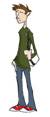
Here are some concepts done a fair while ago now, the design hasn't really differed from the story board except I've given the student character more of an edgy and stylized look. I wanted the designs to stay simple and easy for me to animate, looking at the storyboard I don't even need to do any leg movement so that makes that a lot more easier.

Here are some rough sketches for the business character. I really don't like these, they're just so square and
bland. You can't get much expression from his eyes as well as you could with the student's face.

With both characters, I tried to not over detail them so that I wouldn't have such a trouble to animate them. With the student character in particular, I tried to get what he's feeling and thinking though to the audience just by using his eyebrows and mouth.

Also Becky did a quick colouring of the student concept:

It was only a little something but this was the style i was looking for in my sting, a stylish, urban feel with a hint of exaggeration.

Wednesday 18 March 2009

Right, where were we?

So, having now remembering my blog's password I think I should start uploading all the stuff i've been up to right from the very beginning, the storyboard


I'd say the timing is a but off, but you can get the idea of what's going on. The "student" character needs some sort of reason as to why he's so intreeged by what's in the newspaper. Obviously things have changed since this early storyboard but this was what was going through my head at the time.

Right, I'm off to get some work finished off and then I'm off to watch Iniana Jones and the last crusade, been doing an Inday film a night thing with my flatmate matt. They're both entertaining and good films to study camera shots and angles. I'll be uploading character and background designs tomorrow.

In a bit! =]

Monday 2 February 2009

1st Post!

Hello there. And welsome to my VERY first post up on my all new blog! Hopefully tomorrow I shall be able to upload some of my work for university here soon, so in the mean time just sit back, relax and have a nice warm cup of tea.