All is needed is a little more clean up, the sound (obviously) and the blurred background which needs to be in the second shot:

The magical, creative world of making a 10 second sting!
 I gave this to Becky as a really rough plan to follow. the basic layout and some little ideas such as the tree painted on the wall behind the bustop, which is our little homage to My Neighbour Totoro aswell as showing our inspiration from that film too.
 I really liked this as a first design concept, however Becky felt it was to dark for our sting, and I can see what she was meaning. I felt that the brick wall and bench were also been hidden behind the darkness.
 The next concept Becky shows me is alot more brighter and very stylish. I just love the way the trees are done over the brick wall. I decided that we should use the tree design for the final background.


 We would use this screenshot from My Neighbour Totoro as it's pretty much the same camera shot, it's a bus stop and it also has a monster. It's quite surprising, now with the monster replacing the business man, how it really does have links to this shot. Could of been a sub-concious thought running though my head storyboarding at the time.
 She cam back to me with this image and I have to say I'm very impressed. it's got this tazmanian-devil charm to it aswell as a touch of Totoro. The only fault i have with it is that it's not as edgy as a wanted it to be, then again I didn't really ask for anything specific. I knew I would get some great work from Becky and trusted that she would come through for me. I decided that i would have a go at Her concepts and try to get some expressions and style of the overall sting:

 The first image is roughly about the same as the concept but with more basic shapes and as you look at the third image I slowly start to know the character more.

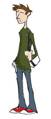
 With both characters, I tried to not over detail them so that I wouldn't have such a trouble to animate them. With the student character in particular, I tried to get what he's feeling and thinking though to the audience just by using his eyebrows and mouth.
 It was only a little something but this was the style i was looking for in my sting, a stylish, urban feel with a hint of exaggeration.